Brand Gallery
Logo, packaging, and visual identity.
This page shows the original design pieces created for the TRUEFUEL brand, including the logo, packaging mockups, product lineup, and brand process.
Final Logo
The final TRUEFUEL logo uses bold black lettering and a bright blue background to create a strong fitness-based identity.
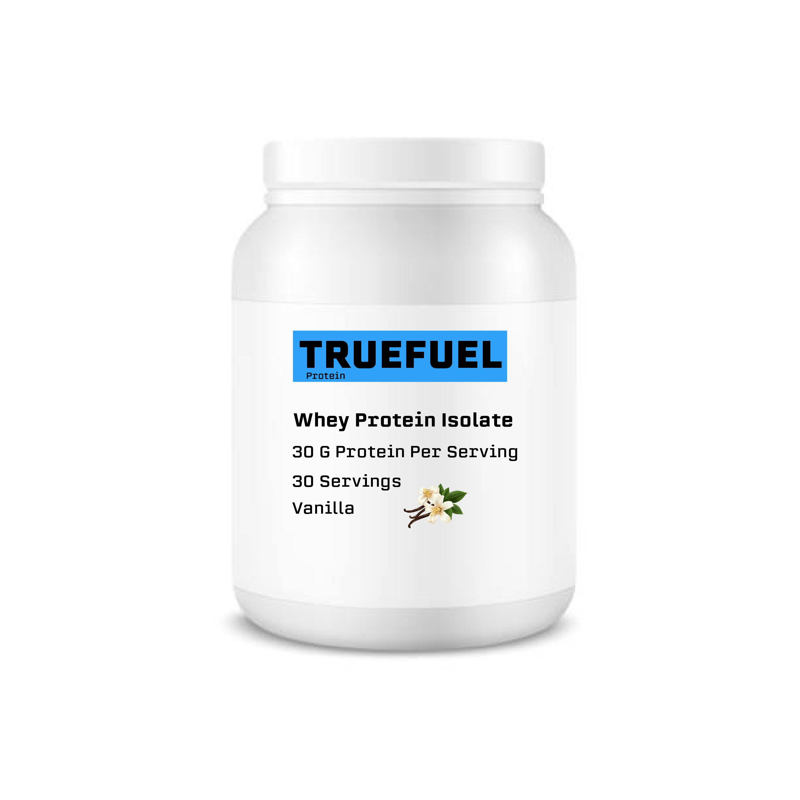
Packaging Mockup
The packaging design uses strong contrast, clean spacing, and clear product information to make the brand feel modern.
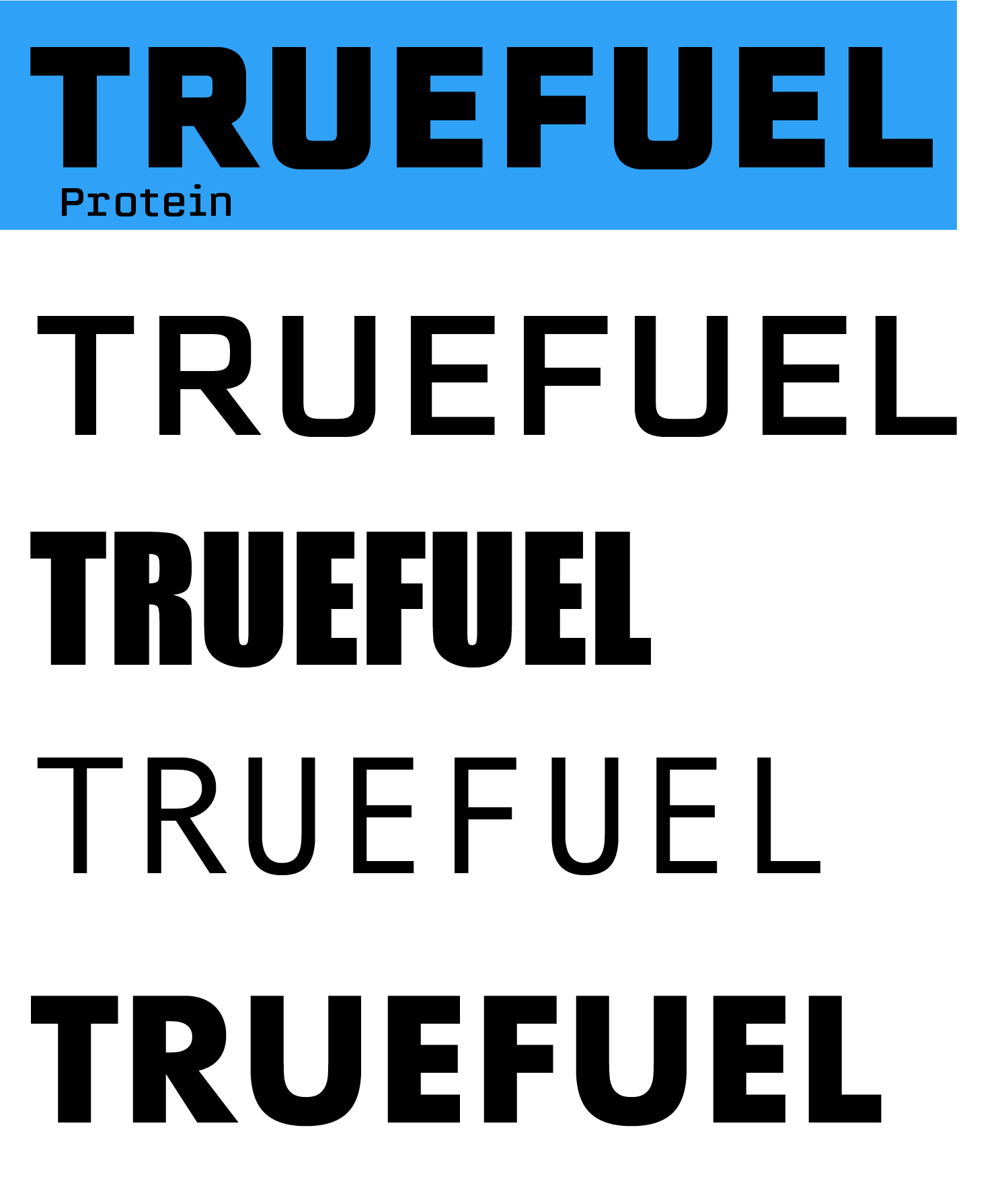
Logo Process
Early sketches explored bold type, sharp shapes, and athletic design ideas that connect to energy and workout performance. The idea for the name came from many fitness marketed health supplements stating they are healthy when many of their ingrediants are unnatural or are chemicals made in a laboratory.
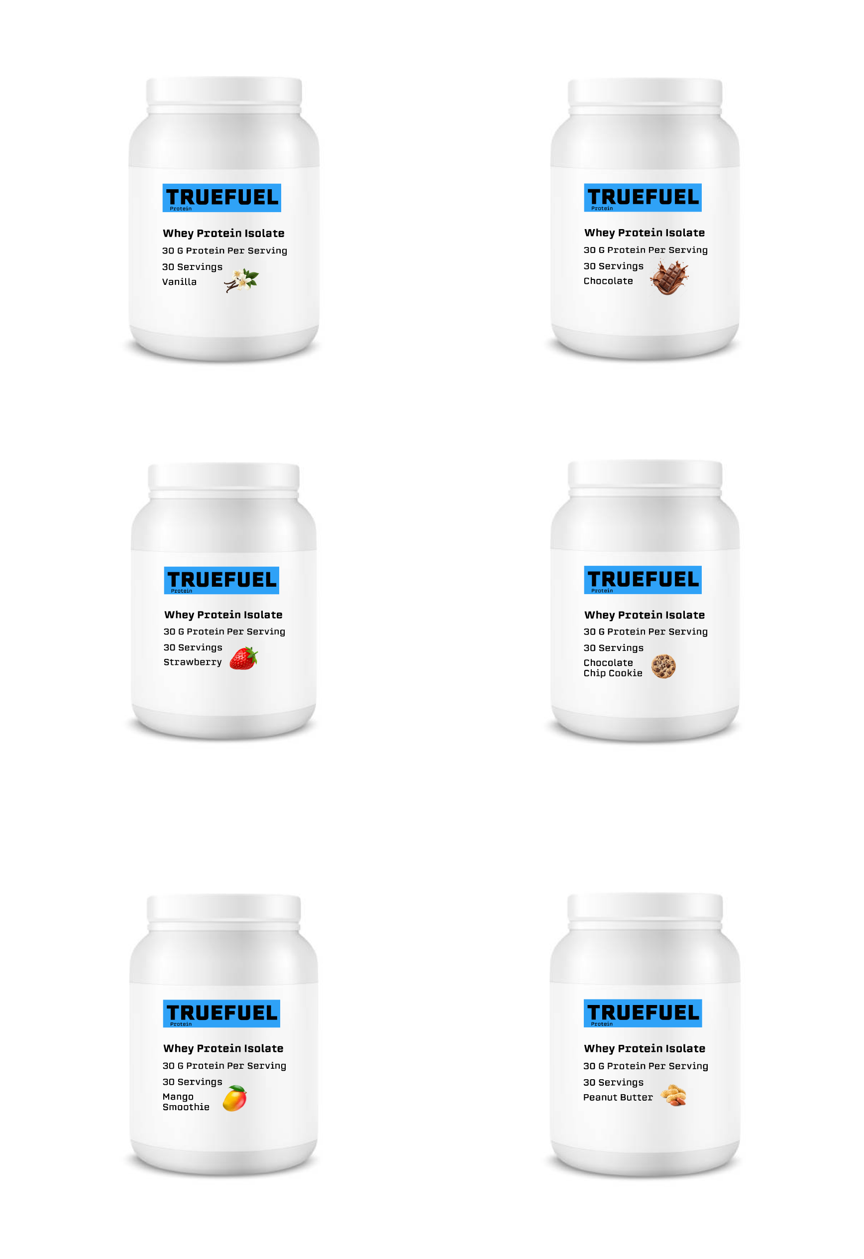
Product Lineup
The product lineup keeps a consistent blue, black, and white system across different protein flavors.
Presentation Statement
For this project, I wanted to create a protein powder brand that looks bold, clean, and energetic. TRUEFUEL Protein uses strong typography, a bright blue color palette, and simple layouts to create a brand that feels connected to fitness and performance. The website was designed to be easy to navigate while showing the logo, packaging, and product ideas in a professional way.